Header Role Intro

Sizzle is a user-centric recipe sharing social platform where users can create, record, and share their own recipes.

Key Achievements

/ 1

Identified project statements and conducted interviews with 25 people to gather feedback, identified demands and pain points, created personas based on Interviewee’s responses, and brainstormed ideas.

/ 2

Create wireframes and low-fidelity designs. Conducted qualitative and quantitive research methods in the testing phase with each iteration.

/ 3

Collaborated closely with developers to ensure the successful delivery of the first edition, aligning the design with technical requirements. Collected feedback from test users, analyzed their input, and implemented multiple iterations to enhance usability and address user needs effectively.

Problem Statement

The current recipe software on the market is often chaotically organized and inserted with massive advertisements. Users need to spend a lot of time choosing suitable recipes to cook. Moreover, it's also a challenge for users to solve their food-waste problem when cooking.

Project Goal

Sizzle aims to provide a healthy, comprehensive, and well-defined ecosystem for those who are passionate about cooking or eager to learn. It allows users to share their creations and foster communication. Sizzle also aims to help users solve their food-waste problems and seamlessly integrate their daily routines with the internet, promoting an efficient and worry-free lifestyle.

Research Summary

We used both qualitative and quantitative techniques to conduct this research. The research consisted of user interviews, usability testing sessions, and surveys to our potential users. By grasping the pain points and user preferences from research, we processed the recommended improvements to enhance the user experience.

Competitor Analysis

Direct Competitors

Yummly Kitchen Stories
Tasty Yummly
Kitchen Stories Tasty

Strengths

  • Biggest recipe apps currently exist in the world
  • Over millions of recipes created by professional chefs
  • Actively updated contents
  • Includes shopping cart functionality
  • Well made trending systems

Weaknesses

  • Not user content driven
  • Not data driven
  • Limited feedback mechanisms
  • Shopping cart doesn't track existing ingredients
  • Complex and chaotic layout

Indirect Competitors

Instagram TikTok
TikTok Instagram

Strengths

  • Huge user base with engaging content
  • Strong data-driven recommendations
  • Video-based content presentation
  • Strong social engagement
  • Accurate recommendation systems

Weaknesses

  • Not food-specific platforms
  • Limited search and categorization
  • No recipe tracking features
  • Lack of specialized cooking features

User Personas

Joanna Williams

Joanna Williams

Homemaker, 35
A recipe Platform that allows for mutual communication will help many mothers in their daily lives!
Amelia Chen

Amelia Chen

College Student, 21
My life needs a meal plan that aligns with my lifestyle habits
Noah Martinez

Noah Martinez

Supermarket Sales, 28
As a new cook, it would be fantastic to have a platform that can assist me in cooking

User Pain Points

01

Organization

Recipes are not organized, tagged very well. The boundary on each catalog is usually vague.

02

Personalization

Users struggle to find a recipe that aligns with their daily routine and lifestyle.

03

Interactivity

Most of the platforms lack interactivity; users find it hard to interact with others.

04

Accessibility

Options for recipes are normally limited for users and usually not beginner-friendly.

05

Information

Fragmented information, making it difficult to find correct information.

06

Ingredients

Often missing some ingredients for recipes

Brainstorming

Brain Storm
Wire Frame

User Flow

Click image to view full size
User Flow
Expand

Sitemap

Click image to view full size
Site Map
Expand

Features

Sizzle Product Intro

Lofi-prototypes

lofi prototype
Recommendation
lofi prototype
Profile
lofi prototype
Recipe
This is the first iteration of Sizzle. The overall design features clean lines and sharp, angular rectangles, contributing to a minimalist aesthetic. Yellow and orange served as theme colors to stimulate the appetite and enhance user engagement.

Quantitive research

Research Questions
(Total 15 participants)
Quantitive Research
Questionnaire
What do you think the function of fridge works with your life routine?
“It can enable me to find the most suitable recipes that align with my life routine and habits.”
“It's cool, but it's kind of hard for me to find this function within the app.”
“It's so easy to manage the food in my fridge, and I believe this function can greatly help prevent food waste problem.”
How do you feel the experience to find the saved mealplans
“I like the way meal plans are separated from the saved recipes, so I won't mix them up.“
“It’s pretty easy to find my history saved meal plans.”
“Overall, it was a good experience, but I'm curious why I can't see my in-progress meal plan in my saved meal plans.”
Are there any parts of using Sizzle that you find particularly easy or difficult?
“Some features are overwhelming. Specifically, the threads and groups sections are too complex...”
“Yes, it's easy for me to create and share my own recipes.”
“It's a good experience though, but there are some awkward or unclear writings.”

Usability testing findings

Icon

Round 1 Findings

  • Some buttons are too small or not protruded enough, users can lose target.
  • Users like the swipe way of the homepage, it's easy and and creative to use.
  • Some directional texts in the app are excessively verbose and occupy significant space.
  • The rating section on the detailed recipe screen raises some questions because of its unclear layout and language usage.
  • Users are pleased to observe icons replacing text as guidance, but the spacing is too cramped, often inadvertently redirecting users to other screens.
Icon

Round 2 Findings

  • After I repositioned some icons and introduced features that allow users to zoom in and out of pictures, they have noticed a significant improvement in their experience.
  • we enhanced the UX writing and provided more concise yet easily understandable prompts in my project. As a result of these improvements, I observed that users, even those using our app for the first time, quickly became more familiar with it.
  • Making the UX writing to be concise yet clear allows users to more efficiently achieve their objectives when using the app.
  • A well-organized and clearly prioritized layout of features makes the distribution of page content more coherent, allowing users to swiftly access essential information.
  • It's essential for us to reorganize the product's layout and establish a strong logical framework for the app.

Comparison

Comparison Comparison Comparison

Hi-Fi prototypes

Afterthoughts

Impact
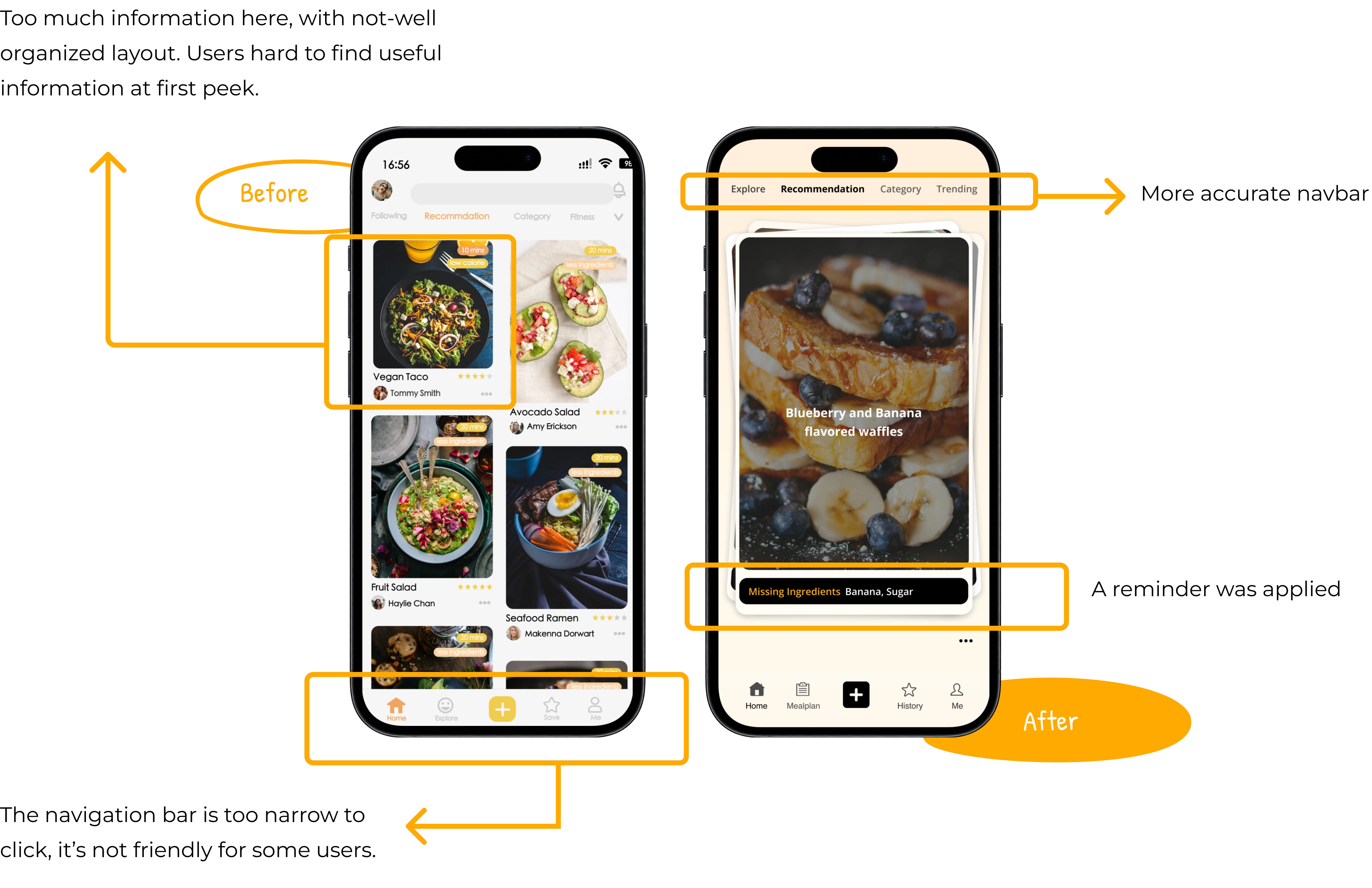
Through this usability study, we discovered that establishing a complete and logically clear functional system can significantly enhance the user experience.
The importance of enhancing the user experience lies not in commercial goals but in constructing a fair, efficient, and empathetic product. It's about integrating technology into everyday life and seamlessly incorporating excellent products into our daily routines.
What I learned ...
Designs that take accessibility into consideration are more user-friendly and convenient. User-centered design doesn't just mean optimizing software functions for user convenience; it also involves adding features that allow users to create content independently and interact with one another within the software. During the testing phase, considering the analysis of different types of user profiles allows me to take into account the diverse needs of users, making the design more detailed and thoughtful.